A design system you can read, copy and adapt
A small, opinionated, View-based design system for Android, written in Kotlin, with no Jetpack Compose dependency. Tokens, themes and components, with the decisions kept visible.
Explore the layers View on GitHub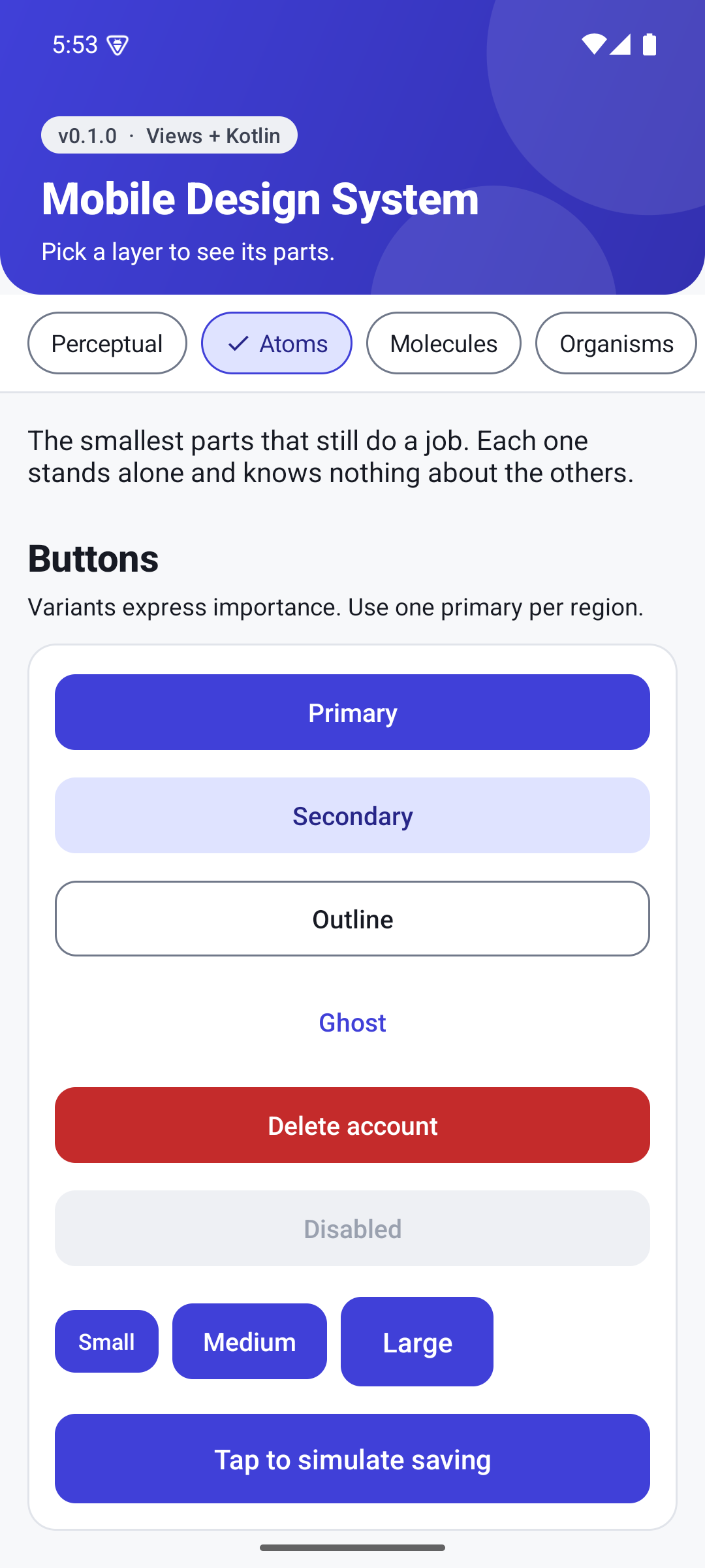
Why it exists
Three tiers of tokens
Primitive values, semantic roles, component defaults. Components only read roles.
One theme, many brands
The Sunset brand is a small theme overlay. Switch it live in the sample app.
Light and dark, same tokens
No per-component dark mode code.
Accessible by default
48dp touch targets, contrast-checked pairs, never colour alone, reduced-motion support.
Small public API
explicitApi() is on, so every public declaration is deliberate.
Organised in layers
- Perceptual
How it looks and feels: tone, motion, theme helpers. - Atoms
Button, badge, chip, avatar, skeleton. - Molecules
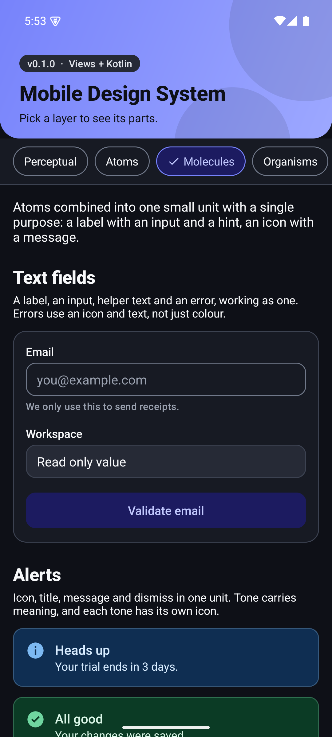
Text field, alert, list item. - Organisms
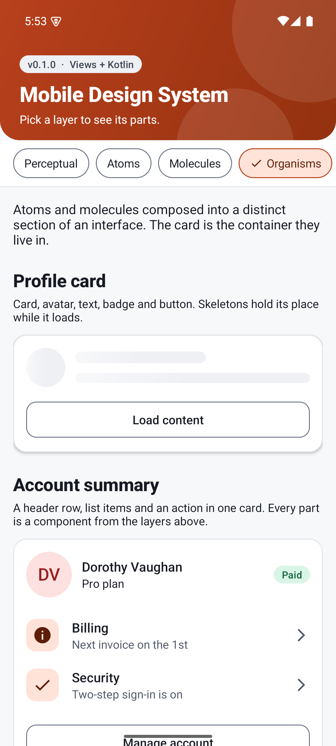
Card, and the compositions built on it. - Templates
Screen layout with the content taken out. - Pages
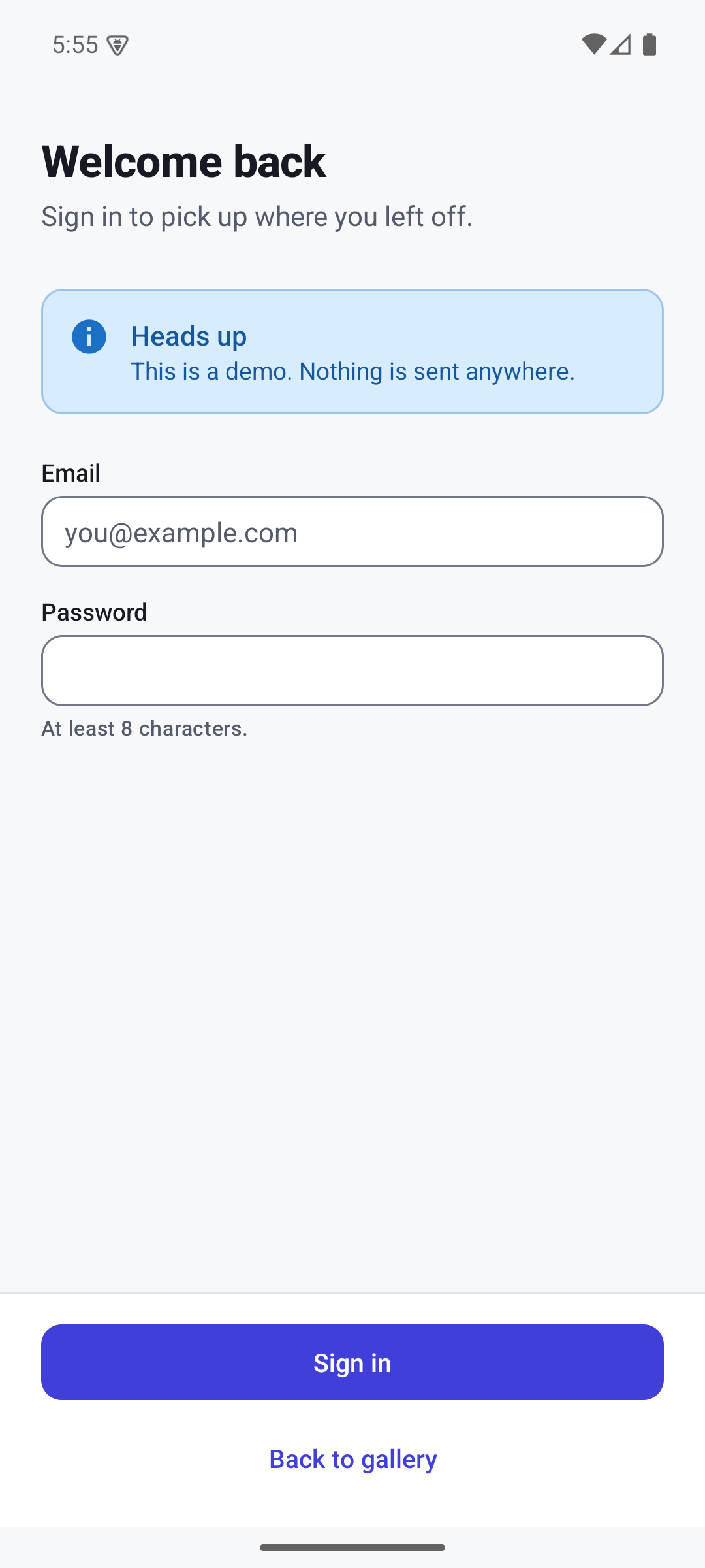
A template filled with real content.
Get started
<style name="Theme.MyApp" parent="Theme.Mds" />
<io.github.liconrepo.mds.functional.atoms.MdsButton
    android:layout_width="match_parent"
    android:layout_height="wrap_content"
    android:text="Continue" />
Then read the principles, the token reference and the theming guide.